Greetings GCSE Students! We're so glad you found us. You're probably looking for information about Mr. Phillips's use of text in his paintings so we thought we'd guide you through a few examples.
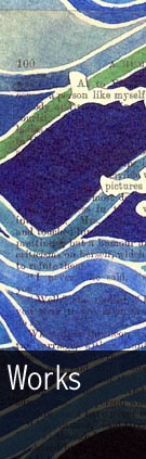
Let's begin with his painting Benches (1971). The artist uses text not only to document the printed origins of the postcards that serve as his source material, but also to draw attention to the artifactual evidence of our temporal human existence within a mechanically-reproduced commercially-distributed context.
This painting is discussed across several pages accessed by clicking the white arrow below, but you may want to follow through to the end of this tour, then click the 'back' button to visit each page individually.
Next let's look at the images from the work Ein Deutsches Requiem, a series of gouaches and collage inspired by passages from the Brahms death Mass.
The series utilizes conventions the artist developed in his 40-year-old project A Humument, and illustrates passages of loss and redemption from the Brahms score with images of loneliness and discovery.
Next let's consider the artist's series of self-portraits, 'Curriculum Vitae.' When you think of self-portraits you probably don't think of long passages of text, but that's what Phillips has done here.
Rather than depict himself with an image (something he has done on multiple occasions) he paints passages of verse that describe different aspects of, and influences on, his life.
Now a more traditional approach to portraiture. On first glance you might only see the faces of the Monty Python troupe, but on second glance (or if you click through on the individual portraits) you'll see a name has been painted beneath each face, each in the artist's recognizable serifed typeface.
But hold on a minute -- those aren't the names of the actors. If you spend a bit of time with each portrait you'll realize the name on the painting is an anagram of the actor depicted. Just because it's a formal portrait doesn't mean the artist and subjects can't have a little fun as well.
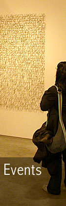
Finally we offer you one of Tom Phillips's wire sculptures -- you couldn't get more textual than this. Some might say it's an outgrowth of the artist's paintings in the 1970's that wove densely-packed rows of text across entire canvasses.
Whether it is or it isn't, it not only draws our attention to the way letterforms coalesce to create meaning, but also encourages us to rediscover the innate beauty of the geometric forms that comprise our written language.